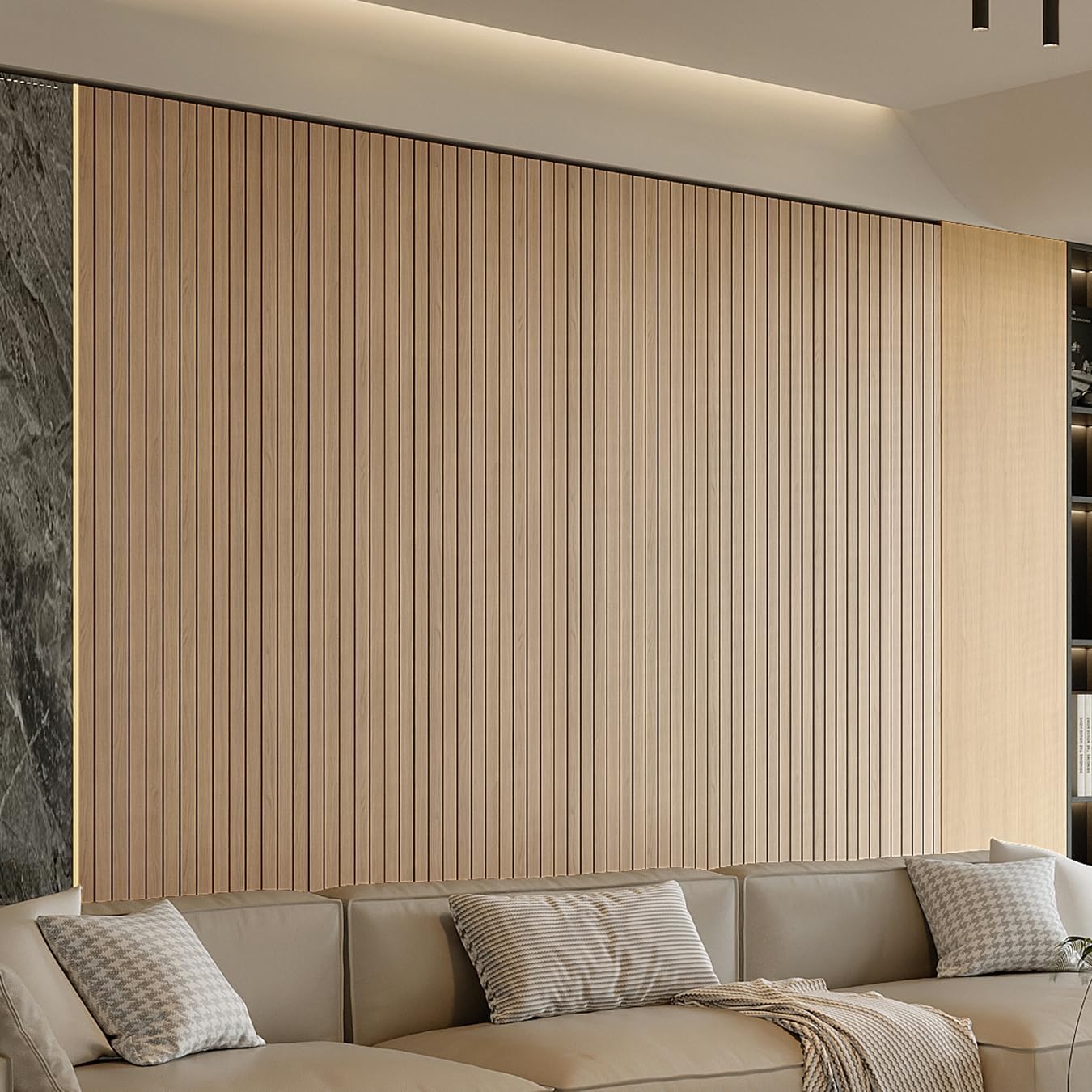
If you’ve ever peeled a swatch of “brick” wallpaper off a sample card and thought this will never fool anyone in a real room — you’re not wrong about that particular sample. But you might be wrong about the category. Faux-texture wallpaper — wallcovering designed to mimic the visual and sometimes tactile character of brick, raw wood planks, or poured concrete — spans an enormous quality range, and the difference between convincing and cartoonish almost always comes down to one variable: the substrate, which is simply the base material the pattern is printed or embossed onto. A substrate can be paper, non-woven (a synthetic blend that feels almost like felt), vinyl, or a textile-backed material. Each one interacts differently with ink, light, and surface relief. This article breaks down which substrates actually hold up for each faux look, where the illusion collapses, and how to make the call for a specific project — whether you’re speccing a restaurant banquette wall or a client’s home-office accent.
| EDITOR'S PICK[YU LI 3DH Peel and Stick PVC Sl…](https://www.amazon.com/dp/B0FDLFB63X?tag=greenflower20-20) | Mid-tier[Timeet Beige White Brick Peel a…](https://www.amazon.com/dp/B092457ZCB?tag=greenflower20-20) | Budget pick[Hopeak Red Brick Wallpaper Self…](https://www.amazon.com/dp/B0B6FNPMDT?tag=greenflower20-20) | |
|---|---|---|---|
| Texture type | 3D slat | Faux brick | Faux brick |
| Color/Finish | Oak | Beige White | Red Brick |
| Removable | — | ✓ | ✓ |
| Waterproof | — | — | ✓ |
| Soundproof | ✓ | — | — |
| Price | $62.99 | $8.54 | $6.99 |
| See on Amazon → | See on Amazon → | See on Amazon → |
Why the Substrate Is Doing Most of the Work
The print is only half the story. A photorealistic brick image printed onto a flat, glossy vinyl surface will catch overhead light in one uniform plane — and that flatness is exactly what the human eye uses to clock “fake.” Real brick has mortar joints that sit 3–8mm below the face of the brick. Your brain registers that depth shadow constantly, even when you’re not consciously looking at it.
Substrates with embossing — a mechanical pressing process that raises and recesses the surface — recreate that shadow geometry. Substrates without it rely entirely on print shading to simulate depth, which works at distance and fails at arm’s length. This is the core tradeoff the whole category turns on.
The three substrate families you’re actually choosing between:
-
Flat vinyl or paper-backed vinyl — Durable, washable, budget-accessible ($2–$6/sq ft at retail). Print quality can be excellent. Embossing is possible but tends to be shallow. The illusion is distance-dependent. Best for large commercial runs where viewers are rarely within 4 feet of the wall.
-
Non-woven (sometimes called “fiberglass-reinforced” or “paste-the-wall”) — The workhorse substrate for residential faux-texture work. Dimensionally stable, tear-resistant, and receptive to deeper embossing. Per Wallpaper Direct’s substrate guide, non-woven products are now the dominant format for texture-forward designs because they hold emboss relief over time without the shrink-and-gap issues common in older paper substrates.
-
3D-relief or foam-core panels — A different product category entirely: rigid or semi-rigid PVC or polyurethane panels, sold by the tile or panel rather than the roll. Brands like Fasade and various imports occupy this space. The depth is real (5–12mm), not printed. The tradeoffs are installation complexity, visible seams at corners, and a cost ceiling that can exceed traditional wallcovering.
Dezeen’s reporting on material realism in interiors notes a broader industry shift: designers are increasingly specifying wallcoverings with genuine tactile variation rather than purely optical ones, because touch has become part of the evaluation in high-end residential and hospitality work.
Faux Brick: Where the Illusion Lives and Dies
Brick is the most popular faux-texture category — and arguably the hardest to execute convincingly at close range. The reason: mortar joints.
On a flat substrate, mortar joints are printed shadows. On an embossed non-woven or foam-core panel, they’re actual recesses. The difference is legible within about six feet of the wall. Architectural Digest’s coverage of designer-specified wallcoverings consistently highlights embossed non-wovens as the minimum bar for brick simulation in client-facing spaces.
Where flat vinyl brick works: Long hallways, above a wainscot cap where the wall reads from across a room, commercial spaces where maintenance matters more than illusion. Budget range typically $30–$80/roll for recognizable brands.
Where embossed non-woven brick works: Dining rooms, home bars, accent walls in living spaces where guests will be seated close to the wall. The emboss depth on quality non-wovens runs 1–3mm — not as convincing as a foam panel but enough to produce real shadow lines under raking light (directional light coming from an angle, like a wall sconce or track fixture). Budget range $80–$180/roll.
The lighting variable nobody mentions enough: Faux brick under recessed downlights (light hitting the wall nearly perpendicular) flattens dramatically. The same paper under a side-mounted sconce looks genuinely dimensional. If you’re speccing faux brick in a space that will have downlights only, budget up for deeper emboss or go to 3D panels — or accept that the effect will be moderate.
One practical note on pattern repeat: Brick is a regular, geometric pattern, so you’d think repeat management is simple. It’s not. Manufacturers often stagger courses (rows of bricks) by a half-brick, which means the vertical repeat can run 8–16 inches. Per the waste math that applies to all patterned wallcovering, plan on buying 15–20% more material than your raw square footage to account for repeat alignment and trim cuts. This is not a markup — it’s geometry.
Faux Wood Planks: The Substrate That Actually Wins Here
Wood grain is, counterintuitively, the faux-texture category where printed-on-flat substrates perform best — and where 3D embossing is least necessary. The reason is that wood grain is itself a flat visual pattern. Real wood planks have very little surface relief; the grain lives in color variation and figure (the term for the organic pattern in wood), not in depth.
This is where high-resolution digital printing on a quality non-woven substrate genuinely competes with the real thing. House Beautiful’s coverage of faux finish renovations has highlighted several wallpaper installations — notably in bathrooms and laundry rooms where real wood is impractical — where the print quality was indistinguishable from shiplap or plank paneling in photographs.
What makes a wood-grain wallpaper convincing:
- Print resolution and color depth. Cheap wood-grain papers use 3–4 color passes. Quality products use 6–8, which captures the subtle warm-cool shifts in actual wood. You see this difference immediately on a physical sample held against a wood reference.
- Matte or low-sheen finish. Real wood is not glossy (unless lacquered). A semi-gloss finish immediately flags “vinyl” to the eye. Specify matte or satin-matte.
- Plank-width variation. Single-width repeat planks read as wallpaper. Products that vary plank widths across the roll — simulating a mixed-width plank floor or wall — are more convincing because real plank installations vary.
- Subtle surface texture. Even a light grain emboss (under 1mm) adds enough tactile variation to support the visual.
The substrate call for wood: A quality non-woven with matte finish is the right spec for 80% of residential wood-grain projects. Flat paper works in low-humidity rooms at lower budgets. Avoid high-gloss vinyl for anything meant to read as natural wood.
The Spruce’s room-by-room wallpaper guide flags humidity resistance as a key variable for wood-look installations — non-woven substrates with vinyl-infused coatings hold up in bathrooms; raw paper does not.
Faux Concrete: The Category That Demands the Most from Color Grading
Concrete is the hardest faux-texture look to execute well — and the most forgiving substrate choice, because authentic concrete has almost no surface relief. Polished concrete is nearly flat; formed concrete has very subtle bug holes and aggregate variation. You don’t need embossing. You need exceptional color grading.
By the numbers:
- Real concrete color range: roughly 10–30% luminance variation across a wall surface
- Budget concrete wallpaper: typically 3–5% luminance variation (reads as uniform gray)
- Quality mid-premium concrete wallpaper: 8–15% variation with directional drift
- Luxury/custom printed concrete murals (Calico Wallpaper, Flavor Paper): 20%+ variation with site-specific colorway options
That variation differential explains why most budget concrete wallpapers look like a gray painted wall — there simply isn’t enough tonal movement to read as a material. Per Dezeen’s coverage of material-realist interiors, the designers specifying concrete wallcovering at the luxury tier are almost universally working from custom colorways matched to the specific room’s light conditions.
What actually works at accessible price points: The mid-premium players — Burke Décor, Wallpaper Direct’s own-brand lines, and select Anthropologie Home murals — have meaningfully improved concrete colorways since 2023. The approach that holds up is an oversized mural format (meaning the image is scaled to the full wall height with no tile repeat) rather than a repeating tile pattern. Tiled concrete wallpaper almost always telegraphs its seams because concrete doesn’t repeat.
Substrate call for concrete: Flat non-woven with matte finish. Embossing adds nothing useful here and can actually break the illusion by introducing a texture that real concrete doesn’t have. The entire burden is on the print, which means sample-before-you-buy matters more for concrete than for any other faux-texture category. Order a physical sample, tape it to the wall, and look at it under the room’s actual lighting for 48 hours before committing.
The Decision Matrix: If X, Then Y
Here’s the practical framework for making the substrate call on a current project:
If the wall will be viewed from less than 6 feet away (home bar, dining banquette, bedroom accent): prioritize embossed non-woven for brick, matte non-woven for wood, oversized mural format for concrete.
If the lighting is exclusively downlit (recessed cans pointing perpendicular to the wall): embossing underperforms — add a sconce or picture light to create raking light, or upgrade to 3D foam panels for brick.
If the room has humidity exposure (bathroom, laundry, kitchen backsplash zone): specify vinyl-coated non-woven only. Raw paper substrates will bubble. This is the one constraint that overrides aesthetic preference.
If the client will touch the wall (a kid’s room, a tactile-focused hospitality space): foam-core panels for brick, lightly embossed non-woven for wood, flat non-woven for concrete — and budget for the installation complexity that comes with panels.
If budget is the binding constraint in the $30–$80/roll range: Wood grain on flat vinyl is your highest-performing option in this tier. Brick and concrete at this price point are distance-only illusions. Set client expectations before installation, not after.
If you’re working at the $200+/roll luxury tier: Phillip Jeffries, Élitis, and Calico Wallpaper all produce faux-texture options with custom colorway programs. The fabrication lead times run 8–14 weeks as of mid-2026; build that into your project schedule.
One rule that applies at every tier: get a physical sample before you commit. Color on a screen is calibrated to the monitor, not to your room’s light source. The Architectural Digest and House Beautiful coverage of faux finishes that disappointed clients points to the same root cause almost every time — the product was approved from a digital image. A $5–$15 sample is the single cheapest insurance in this category.
The substrate question isn’t glamorous, but it’s the one that determines whether a client stands in front of that wall and says “that’s beautiful” or “that’s wallpaper.” Know what you’re buying before the rolls arrive.