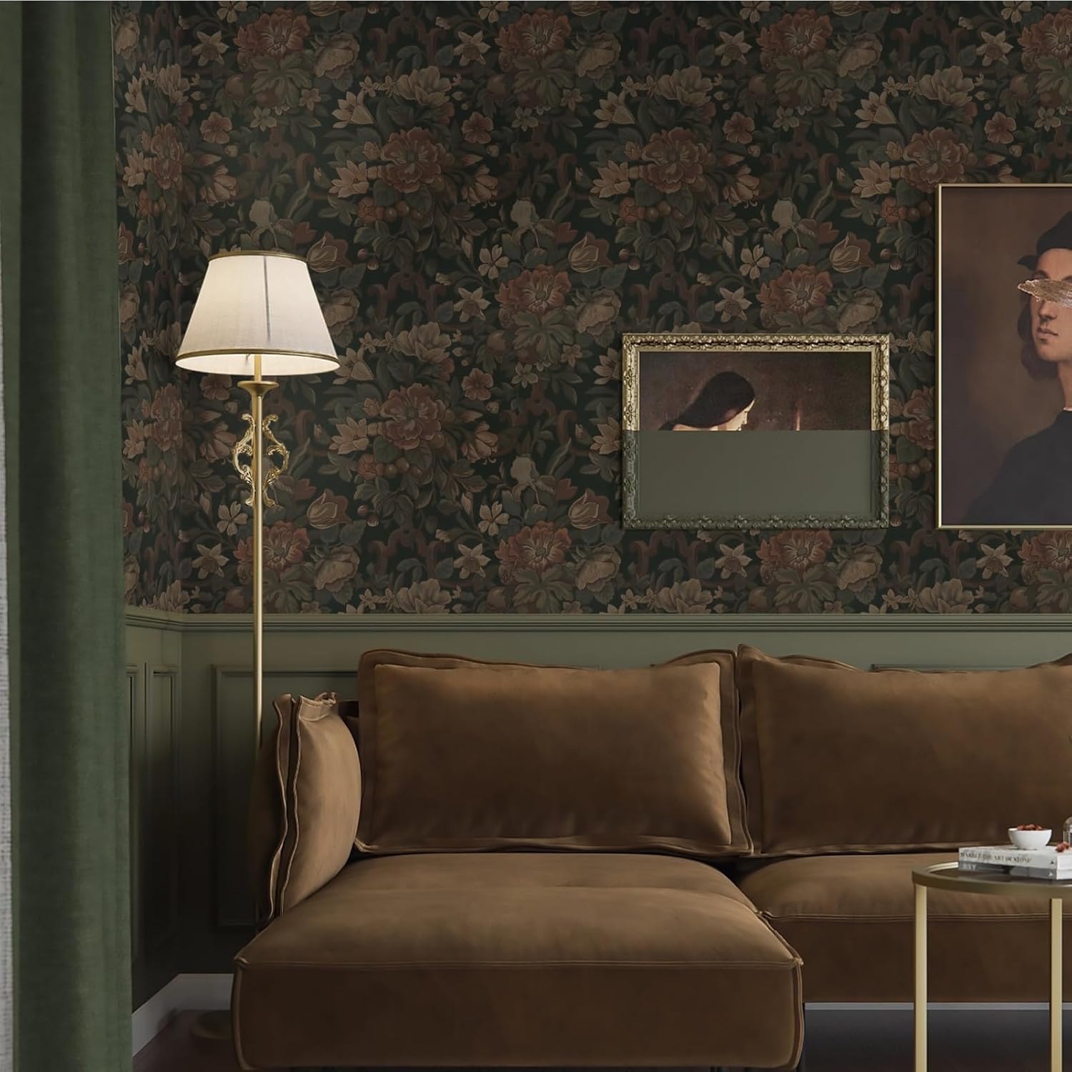
Dark floral and moody botanical wallpaper sounds like a commitment — and honestly, it is. But it’s the kind of commitment that, done right, turns a forgettable room into the one everyone remembers. If you’re new to this corner of wallcoverings, here’s the plain-English version: “dark floral” means patterns featuring large-scale flowers, leaves, or botanicals printed on deep, saturated backgrounds — think inky navy, forest green, charcoal, or burgundy, rather than the white or cream grounds you’d see in a classic chintz. “Moody botanical” is the broader umbrella — it includes jungle prints, oversized fern and palm motifs, aged-herbarium illustrations, and painterly florals, all sharing that same dramatic, light-absorbing quality. This article will walk you through the specific decisions — room placement, substrate (the material the paper is printed on), pattern repeat math, and sampling strategy — that separate a stunning result from a $2,000 mistake. If you have a project under consideration right now, this is the decision framework you need.
Why This Category Has a Higher Regret Rate Than Almost Any Other
Dark florals are visually irresistible in mood-board form. The problem is that what reads as lush and sophisticated on a 4×4-inch digital swatch often becomes overwhelming at scale — or, in the other direction, underwhelming in a room that doesn’t give the pattern room to breathe. According to House Beautiful’s feature on moody rooms that work, the most common post-installation complaint isn’t that the color was too dark; it’s that the scale was wrong. A pattern with a 36-inch repeat (meaning the motif fully completes and restarts every 36 vertical inches) can look balanced in a dining room with 10-foot ceilings and feel chaotic in a powder room with 8-foot ceilings.
There are three specific failure modes worth naming before you commit:
1. Dye lot drift. Dark colorways — especially deep greens, navies, and saturated blacks — are the most sensitive to dye lot variation, the natural shift in ink concentration that happens between separate print runs. Even premium brands aren’t immune. Elle Decor’s trend feature on dark florals specifically flags this as a sourcing risk with custom-colorway papers, noting that re-orders more than six months after original production can show visible variance on the same wall. The fix is straightforward: order all rolls from the same dye lot in a single purchase, and always order your overage (more on that math below) at the same time.
2. Wrong substrate for the room. “Substrate” just means what the paper is made of — nonwoven (a synthetic fiber blend that’s paste-the-wall and tear-resistant), traditional paper (paste-the-paper, more delicate), or specialty backings like grasscloth, silk, or canvas. Dark botanicals are produced across all of these. The substrate matters enormously in high-humidity rooms. A fiber-backed or paper-faced product in a bathroom without excellent ventilation will buckle at seams within a year. Architectural Digest’s feature on dark walls notes that nonwoven substrates are now the default recommendation for any room that sees temperature swings or moisture — not because they’re cheaper, but because they perform.
3. Underestimating the total installed cost. The per-roll price is only part of the number. An experienced paper hanger charging $75–$125 per roll for installation on a large-repeat pattern isn’t gouging you — large repeats mean more waste cuts and more precise alignment, which means more time. A 24-roll dining room project at a $450-per-roll paper price plus $100/roll installation is a $13,200 commitment. Know that number before you fall in love with the paper.
The Pattern Repeat Math (And Why You Always Buy More Than You Think)
This is the piece most buyers underestimate, and Wallpaper Direct’s waste calculator documentation lays it out clearly: every time an installer cuts a new strip, they have to align the pattern before trimming. The larger the repeat, the more paper gets sacrificed to that alignment cut.
By the numbers:
- 0–9 inch repeat (small/random): budget 10–15% overage above your raw square footage
- 10–21 inch repeat (medium): budget 15–20% overage
- 22–36+ inch repeat (large/half-drop): budget 25–35% overage
- Specialty murals with precise placement: budget a flat extra panel per wall
Here’s the practical translation. Say your dining room has 180 square feet of wallable surface (walls minus doors and windows). The paper you love has a 27-inch repeat and comes in a double roll that covers 57 square feet. Naively, you’d calculate 180 ÷ 57 = 3.16, so four double rolls. But with a 27-inch repeat and standard 8-foot ceilings, you should be calculating closer to 230–240 usable square feet to allow for pattern matching — meaning five double rolls minimum, with a sixth as insurance. If you’re working with a paper at $500 per double roll, that’s the difference between a $2,000 and $3,000 order. This isn’t a markup. It’s math.
The additional rolls also protect you against the dye lot problem: if you return unopened rolls, most retailers will accept them. If you run short and the dye lot is discontinued, you’re repainting the room.
Room Placement: Where Dark Florals Actually Work
Not every room is a candidate, and being honest about that upfront saves real money.
The strongest use cases:
Dining rooms are the canonical home for this look, and for good reason. You’re in a dining room for specific, contained periods — the lighting is usually warm and deliberate, and the drama of the pattern gets activated rather than exhausted. Dezeen’s 2025 botanical wallpaper trend report notes that dining rooms account for the largest share of high-specification dark botanical installations, precisely because clients are willing to commit when the room has a defined function.
Powder rooms and guest bathrooms are the other high-ROI play. A small square footage means even an expensive paper stays within budget, the install is fast, and the intensity of the pattern reads as intentional rather than oppressive. The caveat: substrate choice is critical here (see above), and ventilation matters.
Primary bedroom feature walls work when the pattern has a contained scale relative to the wall — a single papered wall behind the bed rather than all four walls. This approach, sometimes called an accent or statement wall, lets you introduce the look without the full commitment.
Where it tends to fail:
Living rooms with varied light sources are tricky. A dark botanical that looks incredible in your evening mood-board photos may feel actively claustrophobic at 11 a.m. in spring. If your living room gets significant natural light from multiple directions, request a large sample (at least 12×12 inches, ideally 18×24) and live with it taped to the wall for a full week across different times of day before ordering.
Narrow hallways under 4 feet wide often amplify the pattern in a way that reads as visually congested rather than dramatic. Scale is everything.
Sourcing by Budget: The Decision Frame
The dark floral category spans an enormous price range, and the right entry point depends on what you’re optimizing for — commitment level, print quality, or installation flexibility.
Peel-and-stick ($25–$80/roll equivalent): Brands like Tempaper and Chasing Paper offer moody botanical options that are genuinely useful for renters or for testing the look before committing to paste-up. The honest tradeoff: peel-and-stick products in dark colorways show seams more readily than paste-up papers, and the color saturation is somewhat shallower than professionally printed papers. These are worth considering for accent walls and low-risk installations, but reviewers consistently note they aren’t a substitute for traditional installation in formal rooms.
Mid-premium ($150–$400/roll): This is where the look becomes fully realized. Graham & Brown and York Wallcoverings both carry strong dark botanical lines with nonwoven substrates and reasonable repeats. Burke Décor and Wallpaper Direct are both strong sourcing channels here, with good trade discount structures and physical sample programs. This tier is the right starting point for dining rooms and bedrooms where you want production quality without luxury lead times.
Luxury specification ($400–$900+/roll): Schumacher, Elitis, and Phillip Jeffries each have dark floral and botanical offerings that represent genuinely different print quality, substrate complexity, and colorway depth. Cole & Son’s archive prints — particularly from the Botanical Botanica and Fornasetti lines — are among the most cited by designers in aggregated trade reviews for their color accuracy and repeat precision. De Gournay and Fromental operate at a different level still: hand-painted or hand-printed bespoke panels where the “repeat” concept barely applies, and where lead times of 12–20 weeks are standard. If you’re specifying at this level, trade sourcing through a certified showroom is not optional — it’s the only way to access accurate sampling, dye lot assurance, and professional installation coordination.
The Sample Rule Is Non-Negotiable Here
Every category of wallpaper benefits from physical sampling. Dark florals require it more than almost any other. Here’s why: dark backgrounds absorb and reflect light differently depending on the finish (matte vs. satin vs. pearl), and that difference is nearly invisible on a screen but immediately apparent in person. A paper that reads as sophisticated charcoal on your monitor may pull visibly purple or brown under your room’s specific light temperature.
The minimum viable sample for this category is a 12×12-inch physical swatch. The better approach is an A3 or larger sample (most premium brands offer these on request or at a modest fee). Tape it directly to the wall you’re papering — not a white piece of foam board, not a door — and evaluate it in morning light, afternoon light, and your primary evening lighting scenario. House Beautiful’s moody rooms feature specifically recommends the wall-mounted live-light test as the single highest-value step in the dark wallpaper sourcing process.
No exceptions. This is the rule that eliminates most buyer’s regret in this category.
The Decision Rule
If you’re at the point of committing to a dark floral or moody botanical, here’s the clean if/then frame:
-
If the room is a dining room, powder room, or single-feature-wall bedroom and you’ve sampled on the actual wall under actual light — then commit. Order with 25–30% overage, all from one dye lot, in a nonwoven substrate unless the design specifically requires otherwise.
-
If you haven’t sampled in the room yet — then don’t order. Request samples first. The cost of a sample is trivial against the cost of a wrong decision.
-
If the budget is under $150/roll and you’re papering a formal room — then consider whether peel-and-stick is a six-month trial run, not a final answer. Use it to validate the look, then re-specify at the right tier.
-
If you’re specifying at the luxury tier and the lead time exceeds eight weeks — then confirm dye lot hold policy in writing before contract execution. Some brands will hold a dye lot for 90 days; others won’t. Know which situation you’re in.
The look is worth doing. The regret is worth avoiding. The gap between the two is mostly just a physical sample and honest math.